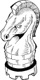
 Well, there indeed are different interpretations, which symbols should represent Chancellor and Archbishop. The SMIRF GUI still is using the pictures beside. But of course, there are other proposals, at least those used by Gothic Vortex. Maybe it could be interesting to get related explanations, why some are preferred.
Sunday, June 3, 2007
Which Icons do exist for C and A ?
Well, there indeed are different interpretations, which symbols should represent Chancellor and Archbishop. The SMIRF GUI still is using the pictures beside. But of course, there are other proposals, at least those used by Gothic Vortex. Maybe it could be interesting to get related explanations, why some are preferred.
Subscribe to:
Post Comments (Atom)
7 comments:
I like the idea of the horseshoe, but I don't know many priests that carry two swords :)
Icons are meant to be symbols, so any image is really OK, if you are consistent with their use.
It is hard to design new things like this, and it is not possible to make everyone happy, of course.
As you could see at a Two Swords picture the form of an Archbishop's influence from the bottom line might easily be interpreted as two swords.
Remember, that the origin of Chess is to be found somewhere between Arabia an India. Thus it does not make very much sense to choose names for the two new pieces, which obviously come from a European or christian tradition like "Archbishop" or "Chancellor" do. Therefore I have proposed very early to use "Archangel" and "Centaur" instead. An "Archangel" is known to be defending the paradise with a flaming sword, and it is a common idea also in Jewish or Islamic traditions, thus having more potential to be internationally accepted. A "Centaur" is an ancient individual having a dual nature, moreover corresponding to old Sumerian and Greek traditions.
It seems to be recommended to define selected symbols for the two new pieces, having at least one significantly different element whithin their icons, for not to be confused with existing pictures like that of a Bishop (which is called Läufer (= runner) in Germany) or with a horse (symbol of a Knight).
When I first convened a "focus group" to research names/piece designs, our original goal was to have 2 new pieces that were "unique." However, when we gathered them together 3 weeks later, less than 25% of them remembered which was the Chancellor and which was the Archbishop!
Now, they had a 50% to get them correct just by guessing, but even that did not help!
So, the idea was, we will make one piece look like the "combination" or two pieces, and the other one will be unique. That way, if they "forgot" one of them, they could look at the other piece, figure out what it was, and then remember that the original piece in question was "the other" piece.
We made the Chancellor look like the combined Rook/Knight piece, and the Archbishop was a unique design. So, when people forgot what the Archbishop was, they would look at the Chancellor, see it was the "Rook + Knight", then they "figured out" the Archbishop was "the other combination", which was Bishop + Knight.
I think ultimately we will change the design of the Chancellor, perhaps to a Bull to symbolize a kind of "minotaur" piece.
But since it cost $90,000 to make a new cavity mold, it may take a while.
Well, I have not thought about costs, only about which name and symbol would make sense.
Also watch the lower half of SMIRF's symbols: You easily could detect a rotated C within the Chancellor's / Centaur's symbol, and find a sort of A within the one of the Archbishop / Archangel.
Be aware that a Centaur indeed is related to a horse below, whereas a minotaur simply has a bull's head, and thus is not at all related to a horse's gait.
Well, from the pictures I saw for the Staunton Gothic Chess set, the piece for the Chancellor is quite unique and a little Queen-like, which would tell that it's similar in value to the Queen. The Archbishop's, well, it just looks like a big bishop; this is very telling.
I found two more pieces at the Portugues Wikipedia page.
http://pt.wikipedia.org/wiki/Xadrez_Gótico
The Chancellor looks odd there as it appears to be a horse sitting INSIDE the Rook's turret!
The problem I have with Centaur is that it is commonly used for the compund of Knight + Man (the Man or Commoner is a non-royal piece that moves as a King). This makes obviously very much sense from what a Centaur is, much more than Rook + Knight.
Like I said in the discussion board, the problem is that the representation of the Rook (meaning Chariot) as a castle already makes little to no sense at all, making it very difficult to elaborate on it in a logical way.
I must admit that in the sense of Archangel the SMIRF symbol is very good. The SMIRF Chancellor I like less, as it has too much of a cut and paste symbol. I must admit that I also experimented with 'modifier symbols' like a hore shoe or riding whip to indicate 'mounted' pieces (i.e. coumpounds that move like Something + Knight), but I never got a result I liked much.
From the Indian-origins point of view, none of the English names make much sense. They are all derived from medieval European court. As Reinhard already indicates, this is often very different in other languages. Due to the Italian's mistake the name of the Rook almost univerally translates to Castle or Tower, though. I guess it caught on because it was on the corners of the board in the initial array, and Towers make sensse there. Knights are called Springer (= Leaper) in German, and plain Horse in many other languages (Dutch, French, Spanish(?)). Bishops are called 'Runners' in Dutch and German, 'Jester/Idiot' in French and Alfil (= Arabic for Elephant) in Spanish. Queens are called 'Lady' in Dutch and German.
I still like the 'Marshall' solution. I bet you that none of the test subjects would ever forget that the sherrif's badge represented a Marshall.
Personally I think a more logical English name for the Archbishop would have been 'Missionary', as that recalls the image of a travelling priest. But the name Archbishop is very common, and the most common alternative 'Cardinal' is not really different, and thus suffers from the same objection, namely that the meaning of the name is only very subtly different from that of an already existing piece. This makes it very hard to come up with a good symbol. I did not want to go against a main-stream name for the piece, so I thought the Gothic-Chess symbol was a good solution: it is a variation on the Bishop's hat, but being flat and wide rather than high and pointy it is clearly distinguishable from it at a low level of optical processing.
Post a Comment